Where Color Meets Simplicity
Pantone is the global authority on color, inspiring artists, designers and stylists to color the world.
In a landscape overflowing with stimuli, color speaks when words fall short. But it’s not just about bright hues or bold palettes—true power lies in simplicity. A single, deliberate color choice can define a brand, capture emotion, and guide user perception in an instant.
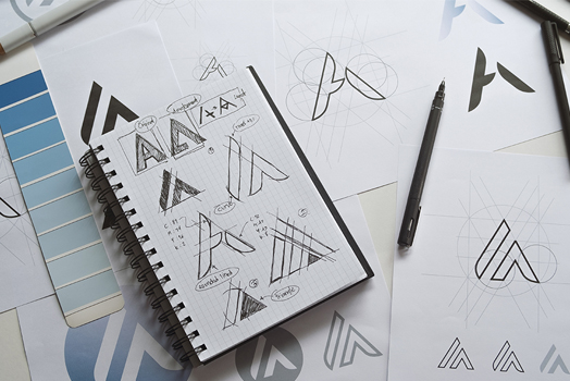
At Company 5.19, we believe that color isn't just decorative—it's strategic. We study how tone, contrast, and saturation interact with layout, typography, and brand intention. Our goal? Deliver minimal yet emotionally resonant experiences that feel both intuitive and unforgettable.
"Color is the keyboard, the eyes are the harmonies, the soul is the piano with many strings."
— Wassily KandinskyPantone’s influence reaches beyond annual Color of the Year announcements. It sets the tone for fashion, interior design, branding, and digital experiences. But we don't chase color trends. We translate them into timeless visual identities that last beyond a season.
Simplicity doesn’t mean stripping things away—it means refining until every choice carries meaning. That’s how we approach color: purposefully, poetically, and always with clarity in mind.
Let’s bring color to your brand—on purpose, not by accident.
How We Work with the Pantone Matching System (PMS)
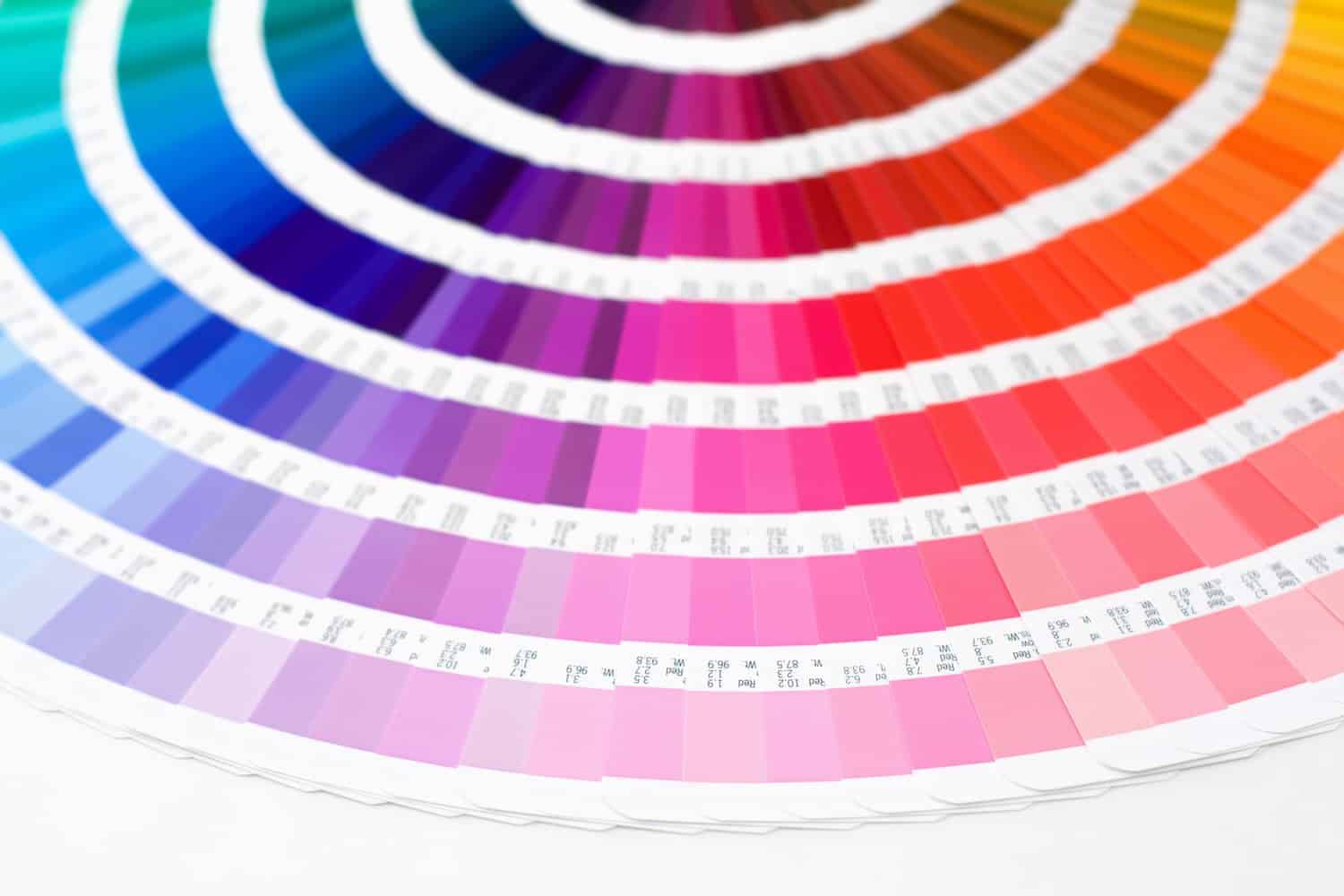
At Company 5.19, consistency is key. We use the Pantone Matching System (PMS) to bring precision and reliability to every brand we build—whether it’s for a printed brochure, digital mockup, or packaging system. PMS bridges the gap between physical and digital, helping us control color fidelity across all materials and touchpoints.
We guide our clients through defining a core brand palette using PMS swatches—selecting primary, secondary, and accent colors that not only look good, but serve a strategic purpose. These become part of the brand’s DNA, a toolkit used across campaigns, platforms, and timelines.
Using PMS allows us to collaborate more effectively with printers and vendors around the world, reducing rework, eliminating color mismatches, and delivering unified brand experiences from screen to shelf.
In every project, color isn’t chosen at random. It’s intentional, replicable, and rooted in emotional resonance. That’s the power of color when wielded with clarity—and the kind of visual storytelling we champion at Company 5.19.